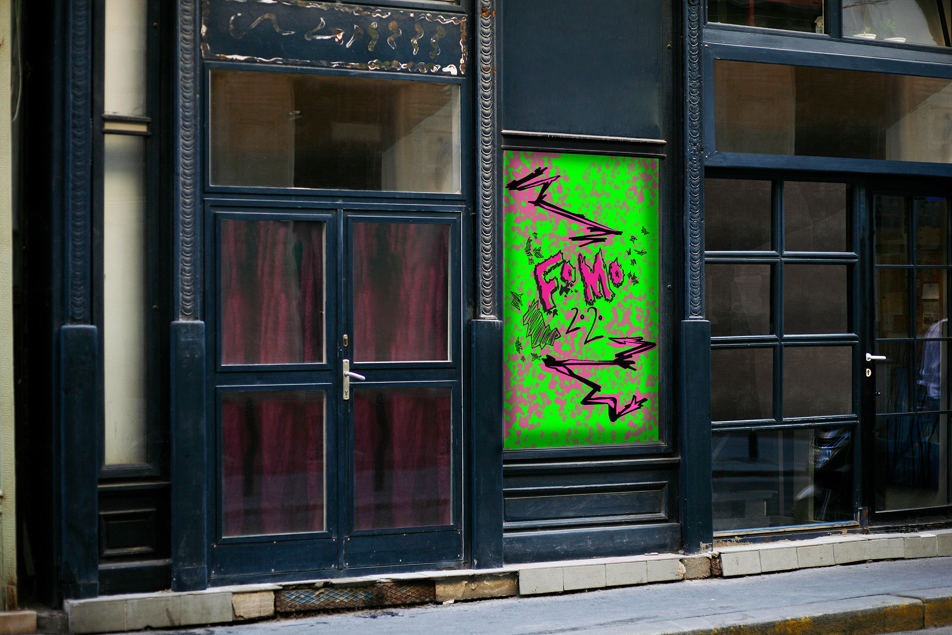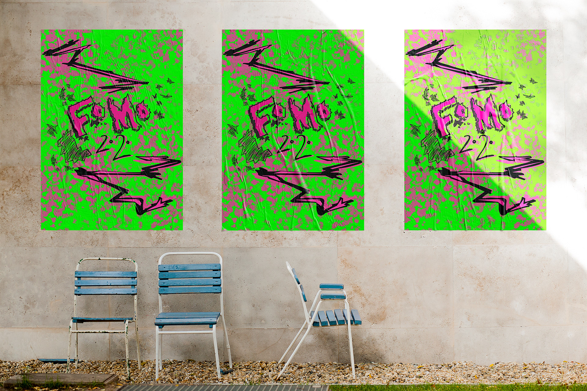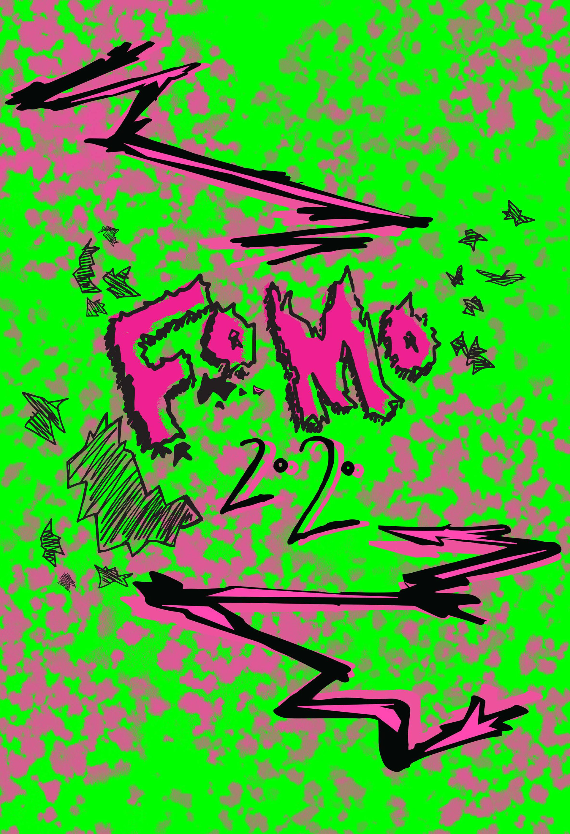
The brief was to advertise a New Zealand Festival of my choice. I kept the same concept of bold typefaces on the original design. As well as keeping one of the main colors; green.
The impression I got from this festival was “Hyped” due to the lineup. So, I based my concepts around patterns. I wanted to create abstract patterns or integrating textures with the text.
I kept my color palette very limited, for the black to contrast. Initially I wanted to integrate hand drawn
designs on my brochure/poster. All my headings were hand drawn to fit this grunge theme. As well as the illustrations. I knew I had to keep the consistent hand drawn theme.
designs on my brochure/poster. All my headings were hand drawn to fit this grunge theme. As well as the illustrations. I knew I had to keep the consistent hand drawn theme.